Cover Design Uncovered Part 2: The Concept

By: Nate on September 4, 2020
One of the biggest mistakes I see new authors make is thinking that their book cover should be completely different than anything else out there in order to “stand out”. It’s easy to see why, especially when their genre’s bestseller list is filled with covers that have many striking similarities between them. In a sea of gray, most authors long to be red—standing out from the crowd and getting all the attention. But an author is better served by saving their uniqueness for their writing rather than their cover concept, and in part two of our four part series on cover design, Nate is here to explain why.
Covering the Basics
So you’ve decided to design your own covers and you’ve hopefully picked out a piece of software. Now we’ll talk about the basics of a cover design, starting with needing one in the first place. As part of my own process, I design the cover before I’ve written a word of the manuscript, and sometimes before I’ve even created an outline for the story. The idea of the story can be enough, especially if I’m familiar with the genre.
And speaking of the genre, knowing which your book will fit into (and ultimately what audience that you’ll be targeting) is the very first step in creating an amazing cover that’ll help sell your book. If you’re familiar with the genre you’re writing because you’re a fan, you’ve probably seen your share of cover art and might have noticed some similarities. That familiarity is an advantage when you’re deciding on your cover concept, but what if you’re just starting out or you’re an established author looking to break into a new genre? That’s when it pays to check out the competition.
Meets Expectations
Let’s say that we want to write something in a nice evergreen genre, like paranormal romance. I usually start by checking out the bestsellers, and I recommend that you do, too. You’ll notice similarities in the covers, even among those that might have different subgenres. Don’t believe me? Check out this snapshot of some current PNR bestsellers (in no particular order).
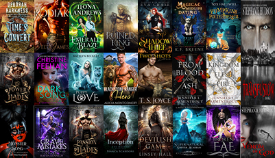
The first things you might notice? Lots of black in the background and high contrast, saturated colors in the foreground. There’s a pretty even mix in the genders of the cover models, and even a few with no model at all. Quite a few with fire, glowing models, and moons. There are animals of all sorts.
You’ll also notice that the majority are using serif or script fonts for their titles and author name. This might be a good time for a quick interlude about fonts.
Just Your Type
A typeface is a family of characters or symbols with a consistent design, and a font is a single member of that family. Serifs are lines or flourishes at the end of a stroke, which give serif fonts their name, and fonts without these flourishes are called sans serif. Here’s an image to illustrate the major font types, which hopefully will make them a little easier to spot in your bestseller-browsing travels.
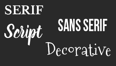
You can see that the sans serif fonts are missing the flourishes on the end of each stroke. Script fonts are all of the “cursive” examples you might see, and decorative fonts have a structure or design that makes them impractical for anything but ornamental uses. You’ll see decorative fonts most often with children’s books.
A Material World
Now that we’ve identified a few common characteristics in our PNR covers, it’s time to decide on an overall concept so we can gather the materials we’ll need for the composition. At this point, the cover doesn’t need to be finished in your mind; we just want the broad strokes.
For this example, let’s say we want to do a werewolf shifter romance novel. I might do a deeper dive in Amazon’s search results for the more specific werewolf shifter novels we plan to write (or have written) just to make sure I haven’t missed any obvious visual cues that will let people know at a glance what I’m offering. Remember that people love the sense of the familiar. It’s the feeling that they’ve read a book like the one you’re offering before and enjoyed it, and you’re promising more of the same experience, but just a little different in its delivery and packaging.
Looking at the search results for “werewolf shifter romance”, it looks like lots of manchest and lots of moons, so we’ll start there when it comes to our stock art. In case you didn’t catch it, the preface for this series explained some of the pitfalls when it comes to stock art licensing, so check it out if you haven’t already. My go-to for stock art is DepositPhotos (they do a great photo credit deal with AppSumo once or twice a year), but you’re welcome to get your stock from any reputable site. Unless you’re shooting your own stock (which you could definitely do if you want unique stock), prepare to likely use the same model as another author. Also, I think Manchest and Moon might be a good title for our cover.
On the typeface side, be sure to always check licenses. Many cannot be used commercially, or have attribution stipulations (you’d include the attribution on your copyright page). You can find a pile of great free-for-commercial-use fonts at sites like FontSquirrel, but for something a little less well-heeled, I recommend purchasing font licenses at a site such as Creative Market (which is my go-to for all things font-related these days).
Once we have our basic stock and our fonts picked out, I usually go back and pick up a few supplemental stock photos to round out the composition. Like maybe a nice night sky or some clouds. Maybe a forest or a city or some mountains. For me, I think I’ll go with a gritty cityscape with some skyscrapers since my werewolf hero is also going to be a mob boss. One of the great things about royalty-free stock is that you can use it for more than one project, so bank all of your supplemental photos and keep them organized so if you need to grab something down the road for another cover, you’ll know just where to find it. As your design skills grow, you’ll be able to composite photos together to create some truly unique and striking imagery.
In the next installment, you’ll be able to see the stock images and fonts I picked out as we go over some composition fundamentals and start to actually build our cover. Since this is a pretty critical moment, you’ve gathered some resources, and you’re about to start creating irreplaceable art, let me just finish by saying back up your downloaded stock photos and fonts and absolutely, positively, without fail, back up your cover files. For that matter, back up all of your publishing-related files. That means one copy for your design machine, and one copy for a cloud service or other off-site server (and even more backups if you can easily make them). You will never be sad to have too many backups, but you will absolutely be sad to lose your files if you don’t have a backup and catastrophe strikes.
As always, if you have any comments of questions, feel free to leave them below. Good luck thinking about your concept and collecting your materials. I hope you see you next week. Until then, have a great one!
Share this blog
Nate wears a lot of hats, and not just because he's bald—web developer, author, photographer—just to name a few. But his first love is graphic design. For over a decade, he ran a successful creative studio, producing everything from business cards and product packaging on the physical side to logos and websites on the digital side. Since 2014, he's been all-in with self-publishing and also works behind the scenes with Hidden Gems Books. You can find him on reddit, where he's SalaciousStories, the moderator of both /r/eroticauthors and /r/romanceauthors.