Cover Design Uncovered Part 3: The Composition

By: Nate on September 11, 2020
Putting together a cover is more than simply finding some relevant stock images and dropping them all together on a digital canvas. And while there is an overabundance of websites that list all the rules a designer should or shouldn’t follow, not all of them are created equal. In part three of our four part cover design series, Nate goes over some basic design tips on what really needs to be focused on when composing a cover. And then in next week’s conclusion, he’ll demonstrate how to apply even more advanced effects to blend it all together into a professional looking final design.
The Rules for Composition
Now that we have an idea of the cover we want to make and we’ve gathered the necessary stock photos and fonts we want to use, it’s time to start our composition. Composing has lots of rules to keep in mind, and if you search for the “rules of composition”, you’ll get a million hits, many of which list different “rules” than others and/or place them in a seemingly random order of importance.
Depth of field, scale, color, balance, symmetry? These are all important things, but they’re in no way required things for every successful composition in my opinion. Learning about them will definitely increase your skill set though, and I’ll be touching on several as we start to compose our cover, but there are only two rules that you need to absolutely follow without fail if you want to be a successful cover designer:
- Stay organized. This applies to everything from storing your stock images to naming the layers in your compositions to the file names of the compositions themselves. The more organized you are, the more efficiently you can design, and the more cost effective it becomes to create your own covers.
- Back up your work. Always. Every time. In multiple ways (like a cloud storage option and one or two local options). And don’t be afraid to save multiple versions of the same composition if you want to try a couple of different paths without ruining the work you’ve accomplished to that point.
A “rule” that gets an honorable mention when you’re first starting out and are learning the ropes of design though?
Thirds is the Word
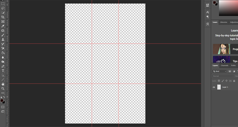
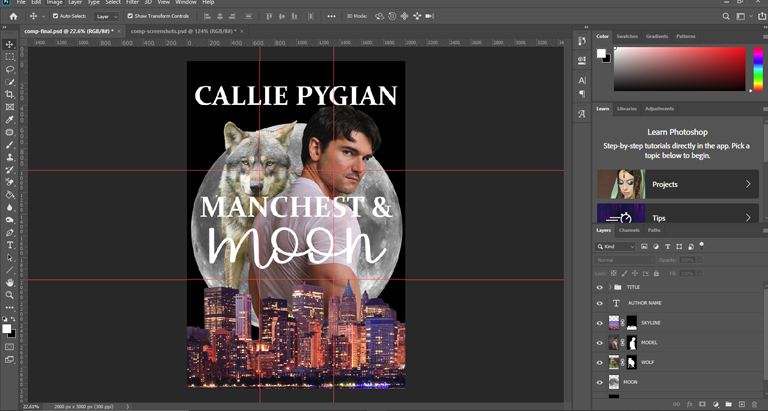
The rule of thirds is a shortcut for composing elements in a visually appealing way. So let’s create a new 2000px (width) x 3000px (height) image at 300DPI. The high DPI will ensure that we can easily transition from digital versions of our cover to print versions down the road if needed. We also create the largest image we could possibly need (so a 2000px x 3000px image can be used for a 5in x 8in cover or a 6in x 9in cover if needed). Then once we’ve created our canvas, we carve it up into a grid of thirds (like the image below) and save using our title and a version number. We want to use the file type for your software that saves your layer structure for further edits; for Photoshop, that’s PSD. So our first version will be named manchest_and_moon_v1.psd.
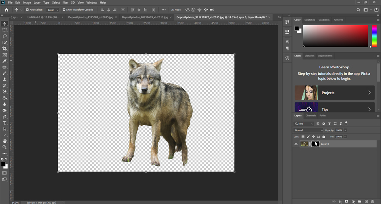
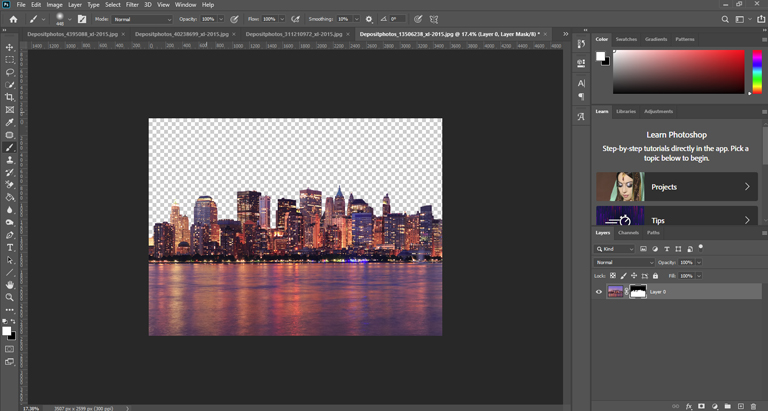
The idea behind the rule of thirds is that you place your horizon along one of the horizontal guide lines and then at the intersections, you place any subjects you’d like to draw your readers’ eye. These are the images we’ll be using for this composition (they’ve been removed from their backgrounds):
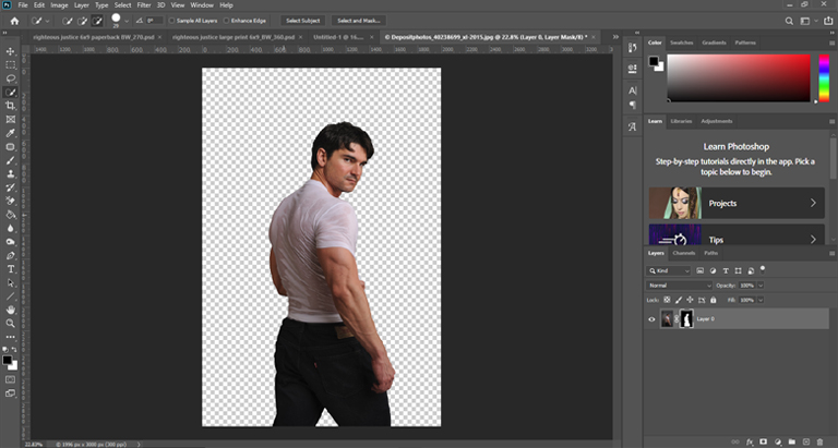
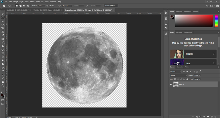
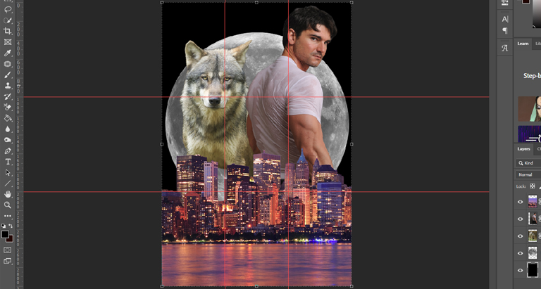
With these four images and another layer containing a black background (which is common in PNR), we can begin to assemble our initial composition. Notice that the model and wolf take up the top two-thirds of the image and are placed so the wolf’s head and the model’s bicep (both points of interest where we want to draw the eye of the viewer) are near intersections in our grid. Placing the moon behind them provides balance and symmetry. In the bottom third of the image, the city skyline provides visual interest and lets viewers know that our PNR has a modern urban setting.
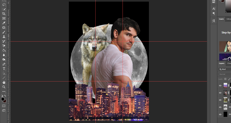
Keep in mind that any first attempt at a composition is not much different than the first draft of a manuscript. It’s probably going to need some improvement. For example, while at first I thought I wanted the waterline in the image because I wanted to create a reflection of the moonlight in the water, I realized that I would rather have more visual real estate for the model. By moving the city skyline completely into the first third of the image, we’ve placed the horizon more naturally along the bottom. And making the model larger allowed us to place his face and the muscles of his arm at two intersection points of our grid while keeping the wolf’s face at a third. Moving the moon down created some negative space at the top of the image, which naturally draws the eye down to our model’s face. Now our composition looks like this:
What’s in a Name?
Now that we have our basic image in place, we need to consider the font. Since many PNR novels use serif or script fonts, we’ll start looking there. My advice is to never sacrifice legibility, so keep in mind that a good font is like a good pair of shoes: it’s possible to be both practical and stylish, and you want both. Some fonts are very practical, and they’re either overused or visually unappealing. Some fonts are very stylish, but they’re very nearly illegible, especially when the cover is viewed as a thumbnail.
Generally speaking, it’s a good idea to be conservative when it comes to selecting fonts. Use too many and the type will lack cohesion and be difficult for the eye to scan. Use too few and your type could lack impact. Using at least two and not more than three is usually a safe bet, especially once you’re first getting your feet wet with design. For this composition, I’ve gone with a simple serif font called Constantia and a script font called Delicate Romance. I’ve placed the author name at the top of the composition (although the bottom would work fine, too), and the title is in the middle third of our grid (although a little higher or lower would work fine if the text was hiding important parts of the image). For your first covers, it’s hard to go wrong with keeping things centered and symmetrical.
That’s it! The very basic first draft of our composition is complete. Next week will be the final installment of this series. We’ll add color and lighting effects to the image to make it more harmonious and apply text effects, adjustment layers, and change layer blending modes to make the final image look more professional and eye-catching. I hope you’ll check it out. If you have any questions, feel free to leave a comment below. Thanks a million and have a great week!
Share this blog
Nate wears a lot of hats, and not just because he's bald—web developer, author, photographer—just to name a few. But his first love is graphic design. For over a decade, he ran a successful creative studio, producing everything from business cards and product packaging on the physical side to logos and websites on the digital side. Since 2014, he's been all-in with self-publishing and also works behind the scenes with Hidden Gems Books. You can find him on reddit, where he's SalaciousStories, the moderator of both /r/eroticauthors and /r/romanceauthors.