Designing Covers by the Numbers

By: Ginger on May 21, 2021
There’s a reason we keep circling back to the importance of a solid cover. It’s the first thing readers see when confronted by a sea of other choices, and if it can’t entice a click to your product page, it doesn’t matter how great your book is. I see it all the time with the ARC program as well, because readers are even picky about the books they get for free. Covers that fall flat end up with way fewer sign ups than similar books in the same genre with well-designed covers. Not only should a cover look like it was done by a professional instead of homemade, but it needs to contain the right genre-specific elements to sell the reader on the idea that this book is the one they’ve been looking for. So just as we argued last week in terms of using data to plan your ads, the same principle should be applied to your cover design.
We’ve written multiple posts about the importance of your cover in selling your book.
- The Importance of a Strong Book Cover: A Case Study
- Cover Design Uncovered
- Most Readers Really DO Judge a Book by it’s Cover
It really is one of the fundamentals – because unless your book entices potential readers, they won’t click on your ads, select your book from another author’s Also Boughts, and it might even put them off buying even after being lured to your product page.
Today, though, I’m going to expand on something I’ve said before – that a cover is more than just an attractive tease about the contents of your book. It’s an unspoken, unwritten contract with a potential reader that you get it.
You get their genre. You get the type of book they like. Book covers are almost like a dress code – and unless you’re dressed appropriately, you’re not getting let into a customer’s Kindle.
But we’ve never really discussed exactly what that means – which is something I’m going to try and tackle today. Getting a cover ‘right’ isn’t a case of artistic genius or luck. It’s a science – a numbers game, that you can decipher and use to your advantage.
In fact, let’s go back to that analogy of a dress code. Normally, a dress code is specific. If you’re eating at a nice restaurant in Del Ray Beach, you’ll need a jacket and a necktie. If you’re eating at the Jersey Shore, it’s “no shirt, no shoes, no service.” If you’re James Bond, it’s a tuxedo and bowtie. There are rules about these things; and rules are basically instructions for those smart enough to follow them.
Take the books in the Top 100 of the Thrillers genre on Amazon. Obviously, this changes every few hours – so here’s a screenshot of what I see right now:
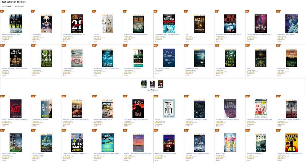
Let’s breakdown the components of the covers scientifically – because then you start to see that there’s nothing random about what makes a successful thriller cover.
Out of the books in the list, how about I do some VERY rough math (I say that since the books change every four hours, so it’s difficult to claim complete accuracy) and look at the trends in cover design.
Typeface
Serif – 18%
Sans Serif – 82%
Title Color
Yellow – 18%
Red – 14%
White – 58%
Blue – 10%
Author Color
Yellow – 26%
Red – 14%
White – 38%
Blue – 22%
The fact that certain thriller conventions are so prevalent (like the dominance of sans serif typeface) perhaps isn’t as surprising as the lack of variety in all the other elements.
While I’ll admit I might have counted a blueish grey as “blue” and a slightly orangey yellow as “yellow” I didn’t need to fudge things much to determine that four colors pretty much make up the ubiquitous palette for thrillers. In fact, there’s almost a formula for the “perfect” thriller cover here!
The broader the category, the more variety you see – which makes sense, since a category like Romance encompasses many different genres. However, even if you drill down just a little bit, you’ll see the same thing. Take my favorite category – Military Romance.
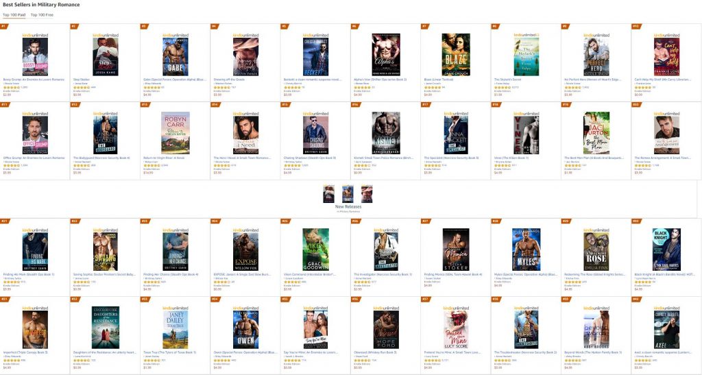
In this genre, you’ll see there’s also a ‘dress code’ that the majority of the books follow:
Cover Model
Shirtless Guy – 46%
Dressed Guy – 28%
Couple – 16%
Scenery/Other – 10%
Title Font
Sans Serif – 56%
Serif – 12%
Script Font – 32%
It’s a little more difficult to discern the two, as ‘script font’ is often one element of the title, and the rest is in sans serif, but I’ve taken the liberty of including all covers with any form of script font together. Likewise, I’ve had to make a call as to whether or not somebody with their shirt hanging off counts as ‘dressed’ or not – but whichever way you look at it, the result is once again like a ‘dress code’ for being included on this list.
Combine script and sans serif typeface and feature a male cover model falling out of a dress shirt, and your book matches roughly 81% of all the other covers featured in the Top 100 for Military Romance – which should be enough to convince you that these elements are not random.
It gets even more ridiculous when you break it down into smaller subgenres, like Espionage Thrillers. As of writing this, more than half featured a shadowy figure running on the cover, and every book featured the same dominance of sans serif typefaces and an almost ubiquitous trio of color palette options. Go and check the books out for yourself! You’ll see what I mean!
(And try the math for yourself – you’ll see it’s pretty time consuming, but the trends are immediately obvious.)
Well, then – what does this mean for you, as an author?
It means it’s never been more important to do your research before you slap a cover on your book – but it also means that your research can really, really help you.
The first thing you have to do is be resolutely disciplined about which category you want your book to exist in. You can have you book listed in up to ten categories, but you have to focus on the dress code of just one or two if you want to make an impact in those lists; since the cover consensus for one of your categories might be completely incongruent with another.
Then, you want to do research similar to what I’ve done above and start to spot the trends and ‘dress code’ for covers in that category. Stick to those and your book will look like it ‘belongs’ in the category you’ve chosen – and this will subliminally coax a higher percentage of potential readers to give your book a try.
But the final piece of advice I have might seem counterintuitive:
Blend in, by all means. Make sure your covers look appropriate side-by-side with the Top 100 for your chosen category…
…but then, make them stand out.
What do I mean by that? Well, it’s difficult to explain – so I’ll repeat a quote by Pablo Picasso that sums it up perfectly:
“Learn the rules like a pro, so you can break them like an artist.”
Learn what readers are expecting in their book covers, provide it to them, and then add something of your own. And if that doesn’t help, remember how I keep referring to a ‘dress code’ for your book cover. Continue that analogy and you might get what I’m trying to say.
James Bond, for example, might adhere to the dress code of Casino Royale – a black tuxedo and bowtie – but that doesn’t stop him being the best dressed man in the room, without having to resort to fancy gimmicks like a black shirt or brocade waistcoat (I’m looking at you, LeChiffre, cough cough.) If you can strike the balance between blending in and standing out, you’ll have cracked the code which sees authors find breakout success even in saturated categories.
Good luck!
Share this blog
Ginger is also known as Roland Hulme - a digital Don Draper with a Hemingway complex. Under a penname, he's sold 65,000+ copies of his romance novels, and reached more than 320,000 readers through Kindle Unlimited - using his background in marketing, advertising, and social media to reach an ever-expanding audience.


Thanks for doing all that research. Really useful stuff. Data always beats mere opinion. Great blog.
Thank you, Ginger, this is a super-useful post. I had gotten as far as “make it look approximately right for the genre” but I hadn’t thought of crunching data to check myself. Cool approach!