
5 Book Cover Checks to Attract the Right Readers


By: Evan Ye on October 9, 2026




A professional cover can catch a reader’s eye and still send the wrong message about your book. If the design suggests a dark thriller but the story delivers a lighthearted mystery, even readers who enjoy your writing may feel disappointed by what they find. In this week’s guest blog, Evan Ye explores the implicit promise your cover makes to potential readers, and why attracting the right audience takes more than striking artwork.
Drawing on his research into book cover design, Evan shares five practical checks to help you spot mismatches between your cover, genre, blurb, and the reading experience your book delivers. From comparing your design with others in your subgenre to recognizing patterns in ARC feedback, he suggests ways to test what your book’s packaging communicates. Together, these checks can help you identify where reader expectations go astray and whether the cover, blurb, or another part of your book’s packaging needs adjustment before launch.
A polished book cover can fail in an obvious way: it can look amateurish, unreadable, or simply out of place on the shelf.
There is another failure mode that is easier to miss. A cover can look good, attract attention, and still attract the wrong reader.
That matters because a cover is not only a sales asset. It is one of the first filters a reader uses to decide what kind of experience a book is promising. Hidden Gems’ ARC FAQ makes that mechanism especially visible: readers decide whether to request a book partly from its cover, genre or subgenre, and blurb. Before page one, the packaging is already helping a reader decide, “This is for me,” or, just as usefully, “This probably isn’t.”
Good packaging does both jobs. It attracts the right readers and helps the wrong readers opt out early.
That is not the same as trying to engineer positive reviews. Hidden Gems’ ARC readers opt in voluntarily and the reviews are meant to be honest. The goal is simply to make the package accurate enough that readers know what experience they are choosing.
That is the cover promise. Before an ARC goes out or a launch begins, these five checks can help you see whether your cover, blurb, and actual book are making the same promise.
Check 1: The Routing & Shelf Check
Will the right readers see this book—and recognize what kind of book it is?
On Hidden Gems, reader matching starts before anyone opens the book. The main genre helps determine which readers see an ARC, based on their genre preferences. In the New ARCs view or compact email, cover, title, and genre are among the first things readers see; the full blurb and categories come after they open the details.
That creates two different jobs. First, route the book into the most accurate reader pool. Second, make sure the cover looks like it belongs on the narrow shelf you actually mean—not merely the broadest category that could contain it.
Before judging the artwork, check the metadata: is the main genre the most accurate one? Do the subgenre or category labels describe the experience a reader will actually get? A cover cannot fully rescue a book that is being shown to the wrong audience.
Authors often judge covers as isolated images: Is it beautiful? Does it look professional? Does it stand out?
Readers do not see them that way. They see a thumbnail surrounded by other thumbnails, usually while looking for something specific. A psychological-thriller reader, a cozy-mystery reader, and a romantasy reader have all learned different visual cues through repeated exposure.
That is why genre conventions matter. They are not rigid design rules. They are learned shorthand between publishers and readers.
As part of my book-cover research, I manually code current bestseller covers by features such as typography, palette, focal element, and composition. The patterns change sharply from shelf to shelf.
In a Q2 2026 snapshot of Amazon US Thrillers & Mysteries Top 100, 79% of covers were title-led, 71% used a near-monochrome palette, and 64% centered on a single tense focal element such as a silhouette, doorway, or window.
In a Q2 2026 sample of Amazon’s Romance Top 50, 78% were illustrated or painterly, 70% were title-dominant, and 66% used a chunky serif display style.
Fantasy moved again. In a 38-cover sample drawn from Amazon fantasy bestsellers plus a small set of canonical epic-fantasy titles, 73% used illustrated or digital-painting art, 68% used a dark or near-black ground, and 61% centered on a single iconic object or silhouette.
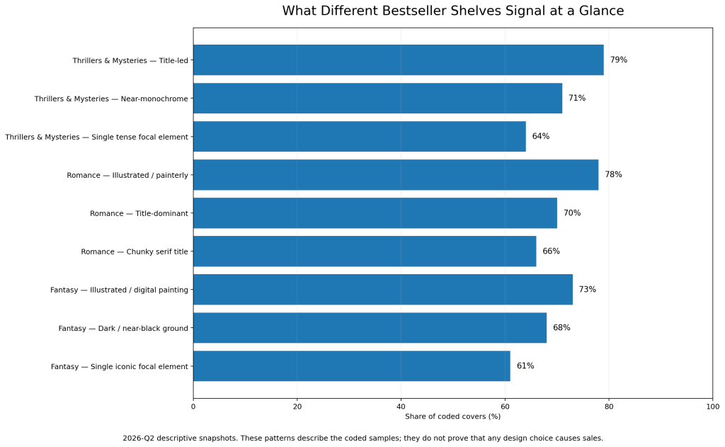
Those numbers are descriptive snapshots, not proof that any design choice causes sales. Their value is simpler: they show that “a good cover” is not one universal thing. The same visual choice can feel perfectly normal on one shelf and strangely off on another.
Try this: shrink your cover to thumbnail size and place it beside 15 to 20 current bestsellers in the most precise subgenre you can identify. Do not ask whether yours is prettier. Ask what shelf a stranger would place it on if the title and author name were unreadable.
The goal is not to copy the shelf. It is to learn its grammar, then be distinctive inside a language the right reader already understands.
Check 2: The Blind-Read Check
What does the cover promise before you explain the book?
Show the cover, by itself, to two or three people who have not read the manuscript. Do not give them the blurb first, and do not tell them what genre you think you wrote.
Ask for three quick guesses:
- What genre or subgenre is this?
- What tone do you expect?
- What kind of reading experience do you think this book will deliver?
Then resist the urge to correct them.
Their wrong guesses are the useful part.
If three people independently call your cozy mystery a dark procedural, or read your romantic fantasy as grim epic fantasy, that does not automatically mean the cover is bad. It means the signal and your intention may not match.
This is also why broad genre labels are rarely enough. Cozy mystery and psychological thriller can sit under the same retail umbrella while using nearly opposite visual languages. “Fantasy” can mean cozy fantasy, romantasy, epic fantasy, dark fantasy, or several other reader promises.
A cover can technically say the right genre while speaking the wrong dialect of it.
Check 3: The Cover–Blurb Check
Does the blurb sharpen the promise, or reverse it?
Once a reader clicks, the blurb should make the first impression more specific.
Imagine a dark, ominous cover that reads like domestic suspense, followed by a playful blurb built around banter and low-stakes small-town conflict. Or a bright illustrated romance cover followed by copy promising a brutal, morally bleak story.
Each element may work on its own. Together, they force the reader to recalculate what the book actually is.
That friction matters because packaging works as a sequence. The cover earns the second look. The genre label narrows the category. The blurb clarifies tone, conflict, tropes, and stakes. Content notes, series branding, and sample pages keep reinforcing the choice.
A useful test is to repeat the blind-read exercise, then show the same people the blurb.
Their expectations should become more precise, not swing in a different direction.
Hidden Gems has discussed reader expectations before: when packaging points readers toward one experience and the book delivers another, the mismatch can become part of the review experience. The safest time to catch that disagreement is before the book reaches a larger group of readers.
Check 4: The Experience Check
Does the book actually deliver what the package promises?
This is the hardest mismatch because the marketing may be doing exactly what it was designed to do.
A cover and blurb can successfully attract readers who want a particular trope, tone, heat level, mystery structure, or ending convention. If the manuscript then delivers a different experience, the wrong audience is not necessarily the problem. The promise itself may be inaccurate.
Write one sentence that starts with:
“This book is for readers who want…”
Finish it with the experience, not the plot.
For example:
“This book is for readers who want a tense domestic thriller with an unreliable narrator and a bleak edge.”
Or:
“This book is for readers who want a warm small-town romance with banter and a guaranteed happy ending.”
Now run that sentence against everything the reader sees and everything the book delivers:
- Cover
- Genre and subgenre
- Blurb
- Tropes
- Heat level or content notes where relevant
- The actual manuscript
They do not have to reveal the same information, but they should point in the same direction.
This does not mean a book should never surprise readers. Genre fiction can and should surprise them. There is a difference between surprising a reader inside the experience they chose and selling them a different experience altogether.
Check 5: The ARC Feedback Check
Are readers disliking the book, or saying they expected a different book?
Early reader feedback can help diagnose a cover promise, but only if you separate ordinary taste from repeated expectation mismatch.
A review that amounts to “I knew what kind of book this was; it just wasn’t for me” is not evidence that your packaging failed.
Different language deserves more attention:
“I thought this was going to be…”
“The cover made me expect…”
“This was much darker/lighter/spicier/slower than I expected…”
One comment is still only one comment. ARC readers are not a perfect sample of your whole market, either, so treat repeated patterns as diagnostic signals rather than verdicts. Do not redesign a cover because a single reader wanted a different book.
Reservation numbers need the same restraint. A weak signup count by itself does not prove the cover is at fault. Hidden Gems’ own romance ARC page notes that signup averages depend mainly on the type of romance, while a strong cover and blurb are also important. Treat low reservations as a reason to inspect the whole promise—routing, cover, blurb, and fit—not as proof that one asset failed.
But if several independent ARC readers keep describing the same mismatch, pay attention to the pattern. They may be telling you that the book was offered to people who reasonably expected something else.
That is useful information before launch. Sometimes the answer is a cover adjustment. Sometimes it is the blurb, category, trope language, or content notes. Sometimes the package is accurate and the book is intentionally crossing conventions.
The point is to diagnose the promise before assuming the cover itself is the problem.
Attract the Right Reader, Not Every Reader
It is tempting to think the job of a cover is to maximize attention.
That is too broad.
A better goal is accurate expectation-setting: help the right reader recognize the book quickly, then let the rest of the package confirm that choice. A cover that attracts a smaller group of perfect-fit readers can be more useful than one that pulls in a larger group who expected a different story.
Self-selection also works in the other direction. If a reader can tell early that a book is not for them, that is not always a lost opportunity. It may be a mismatch prevented before a purchase, ARC request, or disappointed review.
Before your next ARC goes out, do not ask only:
“Will this cover get attention?”
Ask the more useful question:
“What kind of reader is this cover inviting in — and is that the reader this book was written for?”
Share this blog


Evan Ye researches current book-cover conventions across commercial genres and works on MakeMyBookCover, a self-service book-cover platform for independent authors. His research focuses on the visual signals readers encounter at thumbnail scale and how those signals change across genres and subgenres.