Cover Design Uncovered Part 4: The Finale

By: Nate on September 18, 2020
Up until this point, our four part cover design series has taken you through the steps needed to put together a basic cover. Hidden Gems cover designer Nate has gone over topics like selecting the software you’re going to use, how to develop your initial concept, and then how to start putting together your initial composition. In this final part, Nate adds the finishing touches by introducing layers, choosing colors and adding special effects. And then he wraps it all up with a bunch of useful links for those that want to continue upping their cover design game!
The Composition, Revisited
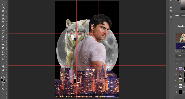
In the last installment, we created this composition for our PNR cover:
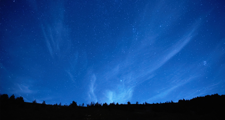
One of the best things about creating your own covers is that you’re able to immediately change things when you decide you don’t like something. Me? I don’t much care for that plain black background that we started with, so let’s drop in a nice night sky instead, like this one:
Once we add it to the background of our composition (keeping the original black background just in case), we get this:
A Cover of a Different Color
Now that we have our final composition, it’s time to start turning it into our finished cover. I generally start with color grading, which is changing the colors, brightness, and contrast of the different elements of our composition to make them more complimentary. You always want to change things about your composition as non-destructively as possible, which means not editing the layers themselves. We’ll be using adjustment layers, but you could also make copies of the layers you want to edit and hide the originals. In Photoshop, you can click this icon to create a new adjustment layer:
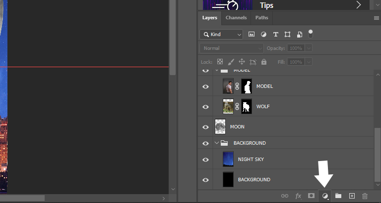
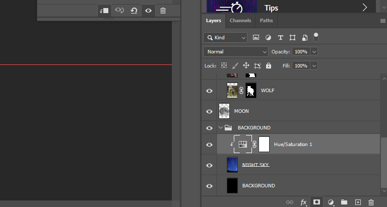
The one we want for now is hue/saturation, so we’ll create one and drag it above our night sky layer. To make an adjustment layer affect only the layer underneath (instead of all of the layers underneath), press CMD/ALT and right-click the line between the adjustment layer and the layer you want it to affect, like so:
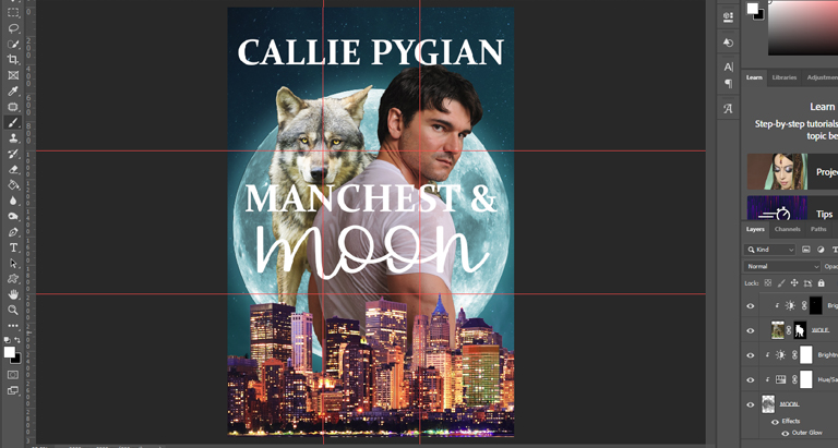
So now that we’ve placed our adjustment layer, which hue are we going for? The easiest way to find complimentary colors is to check out a color wheel:

Since the city scene and our model are both red/orange and warm and saturated, we want to swing the blue in the sky a little more toward green to create a complementary balance. There are several different color relationships, and complementary is the most basic: they’re the colors directly opposite each other on the color wheel, and using them together creates the strongest contrast and visual impact.
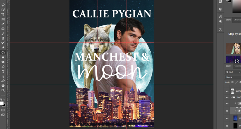
I added color adjustment layers to the model, the sky background, the city foreground, and the moon. I also added a brightness/contrast adjustment layer to all of the pieces of our composition, and once everything is the way I want it, we end up with this:
Just like the composition though, when you’re not happy with something, you’re always free to change it. I wasn’t happy with that purple building in the foreground. It was drawing my eye too much, so to fix it, I created another adjustment layer for our city layer and then masked it (adjustment layers load with a mask applied, so all we need to do is select it and paint black over the places we don’t want the color applied) so it would just apply to that single building (and the purple lights in the foreground, which I also decided I didn’t like). Now it looks like this:
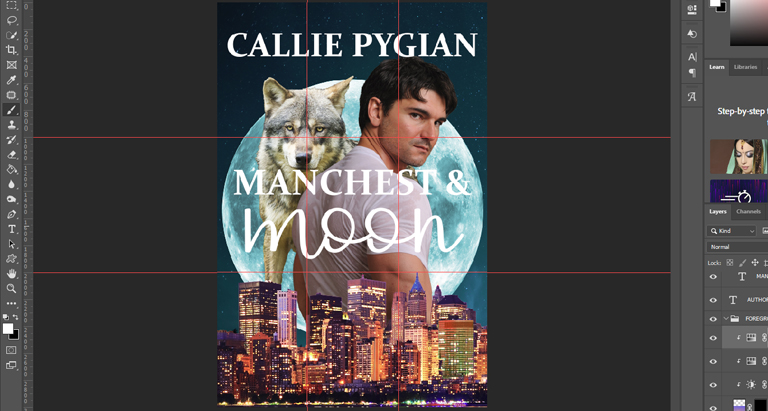
Now to add a couple of simple effects. The first is to bump up the yellow in the wolf’s eyes, which we’ll do with adjustment layers and masks. The second is to add an outer glow layer style to the moon layer. Now we have this:
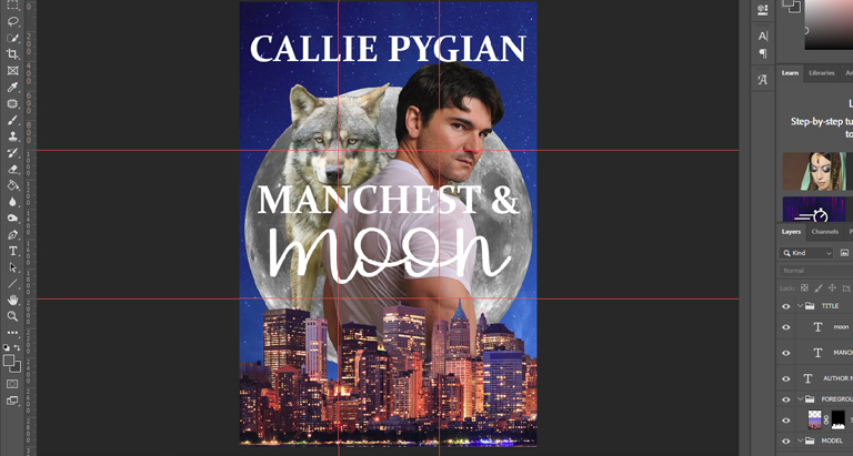
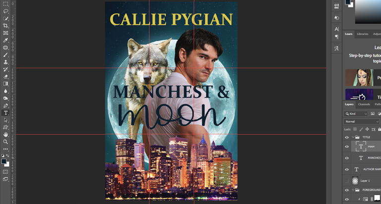
We’re just about done! The last thing we need to do is to give a little TLC to our type, which I’ll do just by adding a little color (and sliding the title down a few pixels away from the wolf’s muzzle and the author name up away from the model’s head). I’ll sample a yellow from the wolf’s eyes for the author name and a nice dark teal from the night sky for the title. Very simple, but effective, just like the cover itself. And that’s it! Our finished cover looks like this:
If you’ve made it this far, thanks for reading! I hope this series has given you more confidence to start your own journey toward creating your own covers. As always, if you have any questions, feel free to leave a comment below.
Recommended Reading
Here are a collection of curated resources that I recommend if you’re interested in stepping up your design game. These are for Photoshop, but most (if not all) of the concepts and tutorials likely have similar methods available for Affinity Photo and GIMP.
Design Fundamentals
- Whether you’re looking to learn more about balance, symmetry, color, negative space, alignment, or other elements of design theory, articles like this one from Canva do a great job at showing real-life examples to go along with the theory.
- If you’ve never seen a color wheel before and don’t know your RGB from your CMYK, Kris Decker has a great primer on color theory.
- Brittany Leaning has a great write-up on the basics of typography.
Professional Techniques
- Unmesh from PiXimperfect has a great playlist for creating professional composites. There are other great tutorials on his channel as well to get you up to speed with all of the basic tools that Photoshop offers.
- Selection techniques are going to be one of the most important and useful tools in your arsenal. This one by Jesus at PTC is excellent when it comes to selecting models and hair from busy backgrounds.
- PHLEARN has a great selection of free technique videos for all skill levels. They also have some excellent premium tutorials available at their website, phlearn.com.
Special Effects
- Marty at Blue Lightning TV has many excellent tutorial videos, but his method for adding realistic tattoos to models is one of the best I’ve seen. He offers lots of other great tutorials as well for all skill levels.
- Nemanja Sekulic has a lot of great tutorials for special effects in Photoshop, including creating a realistic fire effect.
- Slick double exposures are all the rage these days and are very eye-catching. Letsgettoit has a great tutorial on how to create one.
Share this blog
Nate wears a lot of hats, and not just because he's bald—web developer, author, photographer—just to name a few. But his first love is graphic design. For over a decade, he ran a successful creative studio, producing everything from business cards and product packaging on the physical side to logos and websites on the digital side. Since 2014, he's been all-in with self-publishing and also works behind the scenes with Hidden Gems Books. You can find him on reddit, where he's SalaciousStories, the moderator of both /r/eroticauthors and /r/romanceauthors.